
As of today, AnyPerk is no more, and Fond is born. The primary reason is straightforward: while we started as a perks company, we’ve since expanded our product portfolio and will continue to do so in pursuit of a much larger company mission. The name “AnyPerk” was simply too limiting. For more on the strategy, check out our CEO’s post about the overarching reasons for our rebrand. You can learn more about our product strategy in our VP of Product’s post, which also explains the significant product expansions we announced as part of the rebrand. This post centers on the brand itself–the process of energizing a startup brand by teaming up with heavy-hitting brand strategists, thinking deeply about our mission and strategy, and crafting an identity that reflects our aims as an organization. This is a bit of a brand-nerd post, so be forewarned. It was a nine-months long process, but I’m going to cover some of the highlights, starting with forming our core rebrand team.
Step 1: Assembling Our Rebrand Team
We embarked on this process about a year ago, intent on doing it thoughtfully and strategically. The first thing we had to do was to assemble the right team. We met with about ten naming firms and consultants and eventually decided on working with Anthony Shore of Operative Words. Anthony, unlike many naming experts, isn’t part of a “school” of naming. While he is a trained linguist, he insists on neither linguistically evocative–and potentially made-up–names, nor on more literal names. Anthony first considers the context of the business, and comes up with a range of possibilities. We liked that. His portfolio of other projects was also impressive, and not at all limited to tech, (which was important to me): Yum! Brands, Dreyer’s Slow Churned Ice Cream, Avaya and Accenture (from Andersen Consulting).
Obviously, naming was just the first step. We also needed a brand strategy firm to help reconceive of our company visually and provide us with a lite messaging refresh. Once again, we met with a host of impressive firms, but Prophet stood out in the crowd. They were smart, thoughtful, and eager to work with us, despite us being a much smaller company than their typical clients. So, we asked Prophet to join us on our rebranding quest, with Executive Creative Director Tali Krakowsky and Sr. Design Director Paul Wang leading our account as project leads.
|
|
|


Last, we knew we needed strong employee buy-in to make the rebrand a success. I wanted internal brand champions for the launch, and I wanted to ensure we didn’t suffer from insular thinking by not having enough perspectives at the table. So, we recruited employees from completely different departments and brought in several members of the AnyPerk executive team, forming our core rebrand team: the data lead for Fond (AnyPerk, at the time), a business development manager, a salesman, the co-founders, and our VP of Product.
Step 2: Clarifying Our Brand Strategy
Ultimately, our goals were twofold and fairly straightforward:
- Craft a brand identity (name, visuals, language) that reinforces our company mission, along with core components of our strategy.
- Ensure the brand resonates with our target market, maintaining the sense of joy that was pervasive throughout the AnyPerk brand but maturing the brand a bit to connect with a broader range of forward-thinking companies.
This bullseye encapsulates our strategy:
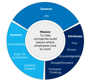
Our mission had to be at the center of the rebrand and at the very least support rather than contradict our new name.
Our strategic anchors describe how we’ll win–what we’ll strive to do superbly well and better than the competition. We simply can’t forget them in any significant company decisions, including a rebrand.
Our attributes are personality traits that add dimension to our voice and were particularly helpful in choosing imagery and language for the new brand.
Finally, our essence is the distillation of the emotion we’re trying to convey through our brand.
Step 3: Choosing a Name
With our strategy in place, we were ready to get started. And by “started,” I mean reviewing 200 names provided by Anthony Shore. Tiring as that may sound, Anthony produced many hundreds more names than the 200 he delivered to us, so he must have been even more word-fatigued than we were. Among those 200 words was “Fond.” It was valuable in so many ways:
- It aligns with the sentiment we hope employees feel about their organizations and employers feel about their employees.
- It’s evocative and less literal than AnyPerk, letting us pursue our mission aggressively by adding a wider range of product brands to our portfolio. It was easy to see how “Fond Perks” and “Fond Rewards” would work with the masterbrand.
- It’s emotive, and emotive words tend to be more memorable.
- Almost everyone is familiar with the word — and known words are more memorable — but because its usage has declined significantly since the early 20th century. That was a huge benefit; there weren’t a bunch of competing associations with the word “fond” that would make it difficult for us to claim it as our brand.
- It’s easy to pronounce. In fact, Anthony informed us that “fond” is pronounced the same in virtually every language.
After a legal check and an internal discussion about Fond compared to our two other final candidates, we happily settled on Fond.
Step 4: Crafting a Visual Identity
Architecting a new visual identity was perhaps the most difficult part of the process. Design rightly evokes emotional reactions in people, but that inevitably leads people to judge design decisions based on their personal reactions. Everyone who has been part of a design process knows this. Prophet employed an iterative process that helped overcome this roadblock, and we were sure to lay the groundwork for how to provide feedback on different design choices. We chose one of three overall design “territories,” and iterated within that territory until it best aligned with our goals.
Here’s the reasoning behind some of our key design decisions:
The Logo
The logo itself is sharp and angular, except for the O formed out of circles (back to that in a moment). That was intentional. There was a risk that the name Fond would subtly convey the message that we’re soft as an organization — that we can’t drive business results. The sharp angles were intended to counteract that potential implication.
Also, the logo has a resting color of navy blue, but it can take on any of the colors in the brand palette (more on that below).
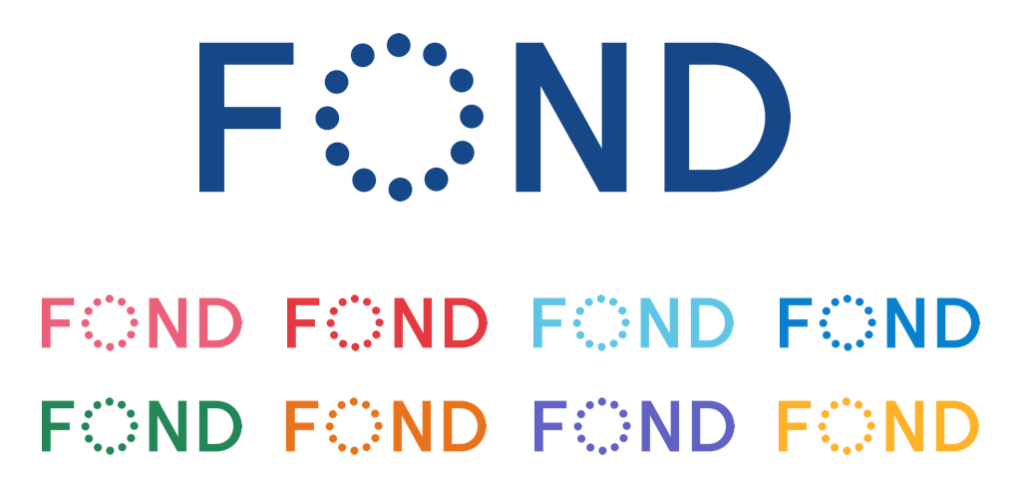
Counterbalancing that sharpness are the circles forming the O. They can be interpreted in a variety of ways, evoking playfulness. They might signify sparks of joy, collections of people, or even individual moments that employees value. Undoubtedly, they represent individuals forming a cohesive whole, just as a company. (Our data team lead saw them as “data,” so there’s really something for everyone in the logo.)
A Joyful Color Palette
You’ll notice a variety of colors. While most brands try to anchor on one or two colors, we wanted to convey flexibility and personalization, which are both key elements of the strategy laid out in the bullseye above. Employees derive meaning from unique experiences, and each of our customers’ companies has a different culture that requires a different approach. Variability of color lets us communicate that personalization and variety of choice.
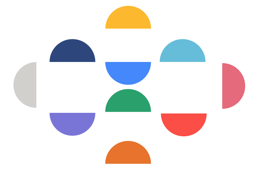
The colors themselves are also key. “Employee happiness” is an oft-used term at Fond, but I concede that “employee happiness” can be a bit nebulous. We stepped back and asked ourselves what we really wanted people to experience if they benefited from our brand, and the word that reigned supreme over all else was “joy.” We chose colors that were lively, bright, and joyful, especially when paired.
Images of Moments that Matter
One thing that became abundantly clear during the rebrand process was how overused images of happy employees at work are in HR technology. The competitive analysis that Prophet conducted double-underscored that point. But we didn’t want to get rid of photography; people are central to our brand. Instead, we decided to pursue lifestyle imagery where the subjects are aware that the camera exists but aren’t posing for it, where they aren’t in any particular context, and where they exhibit some kind of (often strong) emotion. Authentic moments that matter: that’s how we describe it.
Step 5: Launch
That brings us to the present. Over the course of several months our designers, product managers, engineers and marketing communications team toiled over implementing the brand, debating what did and didn’t align with our brand guidelines, redesigning our website and collateral, building internal momentum and preparing for the expansion of our product portfolio.
Ultimately, the rebrand took 9 months — a long time in startup years. But we were committed to doing it right, not rushing through it. A brand isn’t a logo, a tagline, or even just a name. A brand impression is formed by the sum-total of a person’s interactions with a product or company. With Fond, I hope and believe we’ve crafted a brand identity not only reinforces, but magnifies, the experiences our customers and prospects have with us.